This afternoon I was sifting through one of my favorite blogs: ilovecharts (because I really do) and came upon this crafty radar plot for a beer review:


Now, the use of a radar plot isn’t exactly new in wine or beer evaluation. It was originally used for alcohol reviews in scientific research and plenty of examples can be found in the Wine Science text book that sits on my bookshelf in my dining room (because I need easy access when I’m drinking). This one though was created by the guy at beeritual.com and you should certainly head over there if you’re into craft beer reviews or at least for the fact that he does a great job with his photography (much prettier and a whole lot more consistent than mine) and he created his own rating system, which you see an example of above. However, for those of you that followed my sensory series on how we experience wine (start here), you may also have questions like I did. And so, I’ve put them together below:
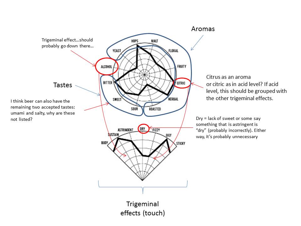 Despite these questions, I think the approach is a good one, meaning it is helpful/entertaining for craft beer consumers. The thing about radar plots is that they look kinda cool regardless of what data points are on them or if those data points actually go together. They are very good for comparing the plot points of one sample to another though which is kind of the whole point. It’d be nice if some wine reviewers got a little more visual with their reviews. As much as I enjoy prose, hyperbolic poetry does get a little old, which is probably why I write things like this. Cheers! Here’s to drinking nerdy.

Leave a comment